In order to optimize your manufacturing website's performance in search engines and in generating demand for channel sales enablement, you must first gain a deep understanding of the desired end state for each website visitor. In other words, you must understand their motivation for being on your website.
Developing buyer profiles or personas will help you define what your manufacturing web design needs to be successful.
While your external marketing may focus on a very specific buyer, depending on the campaign, your website serves a variety of customers. Distributors, dealers, contractors, builders, and end-users/DIYers are all looking for slightly different things when they visit your website.
The best manufacturing websites will have content for every building materials buyer persona. Your website should be laid out so it’s easy for visitors to find exactly what they’re looking for based on their interests. There is a well known building materials manufacturer whose website does this very well - it's the James Hardie Building Products Inc. website.
Now, ManoByte did not build the James Hardie website, but we know a good building materials manufacturing website when we see one, kind of like this one we did build, and we want to ensure you know exactly why James Hardie's website is one you should be taking notes from.
Their manufacturing website includes the following critical components:
- Site navigation relevant to all buyers' journeys
- End user centric website copy
- High value gated resources
- Up to date product specs
- Product installation videos and resources
- Warranty information
- Partner and product locator directory
Site Navigation Relevant to all Buyers’ Journeys
Just as you need to provide content for each type of buyer, you also want your site to provide clear navigation for where different categories of customers are in their buying journey. Because the majority of building materials manufacturers sell through a channel of distributors, you must be all things to all customers in your channel.
What makes a good website navigation?
For building products websites specifically, a good website navigation will allow
- Distribution Partners to find resources and specials easily
- Channel resellers to re-order inventory efficiently
- Contractors to find product specifications and installation videos easily
- End users to research ideal use cases for product types and variations
- Purchasers to easily reference materials they have researched and selected during their buying journey
James Hardie does an excellent job with their primary menu. There are clear distinctions between where to go if you are a returning site visitor, such as a channel partner or re-purchasing contractor, versus where to start researching as an end consumer or first time purchaser who needs help.

When optimizing your website's navigation or re-structuring your entire sitemap, consider ways to
Simplify, simplify, simplify.
Given your product base and your scope of channel offerings, answer this question: "If I only had 7 pages total on my website, what would be the most helpful pages for parters and end customers to see?" This approach will also help ensure your mobile sized website menu is still easily navigable by users.
Provide a straight trajectory for getting in touch with your customer service team.
James Hardie's website does this via the "Product Support" menu item that drops down and provides further options for reviewing FAQs, installation instructions, warranty information, or contacting them. Take notice that "Contact Us" only exists under this "Product Support" menu item, not as it's own top-level menu item. This is also conveniently located right next to the "Pros" jump link that directs to an entirely separate website full of resources gallore for designers, contractors and installation crews to reduce clicks for website visitors who already know most of their product support info is housed on a separate website.
Cater to the visual needs of the modern consumer.
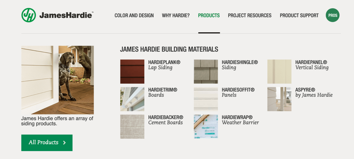
James Hardie's website does this by incorporating imagery into their menu drop downs. For example, each category of trademarked product, they show what it looks like and also refer to it by the industry recognized style. This provides maximum searching ease for any user on their website. Whereas purchasing may see the trademarked product name on their re-ordering documentation, an end consumer looking for ideas to take to their hired contractor, for example, needs to know how to compare styles and types more than anything related specifically to the James Hardie trademarked product name.

End user centric website copy
As the manufacturer, you know your products inside and out and it's important to you what the raw materials are, how your team slaved over engineering the product, and what your manufacturing operations looks like. This matters to some of of your website visitors too, but more and more, your website needs to function similarly to B2C websites, as the B2B buyer's online shopping methods mirror those of B2C consumers. The same person who is ordering a new blender from Amazon is purchasing your building materials to complete a construction project.
This means your website copy needs to leave no doubt that you have the exact thing someone is looking for. This requires you speak to how your product solves the end user's problem or is the perfect fit to match the purchaser's desired end state.
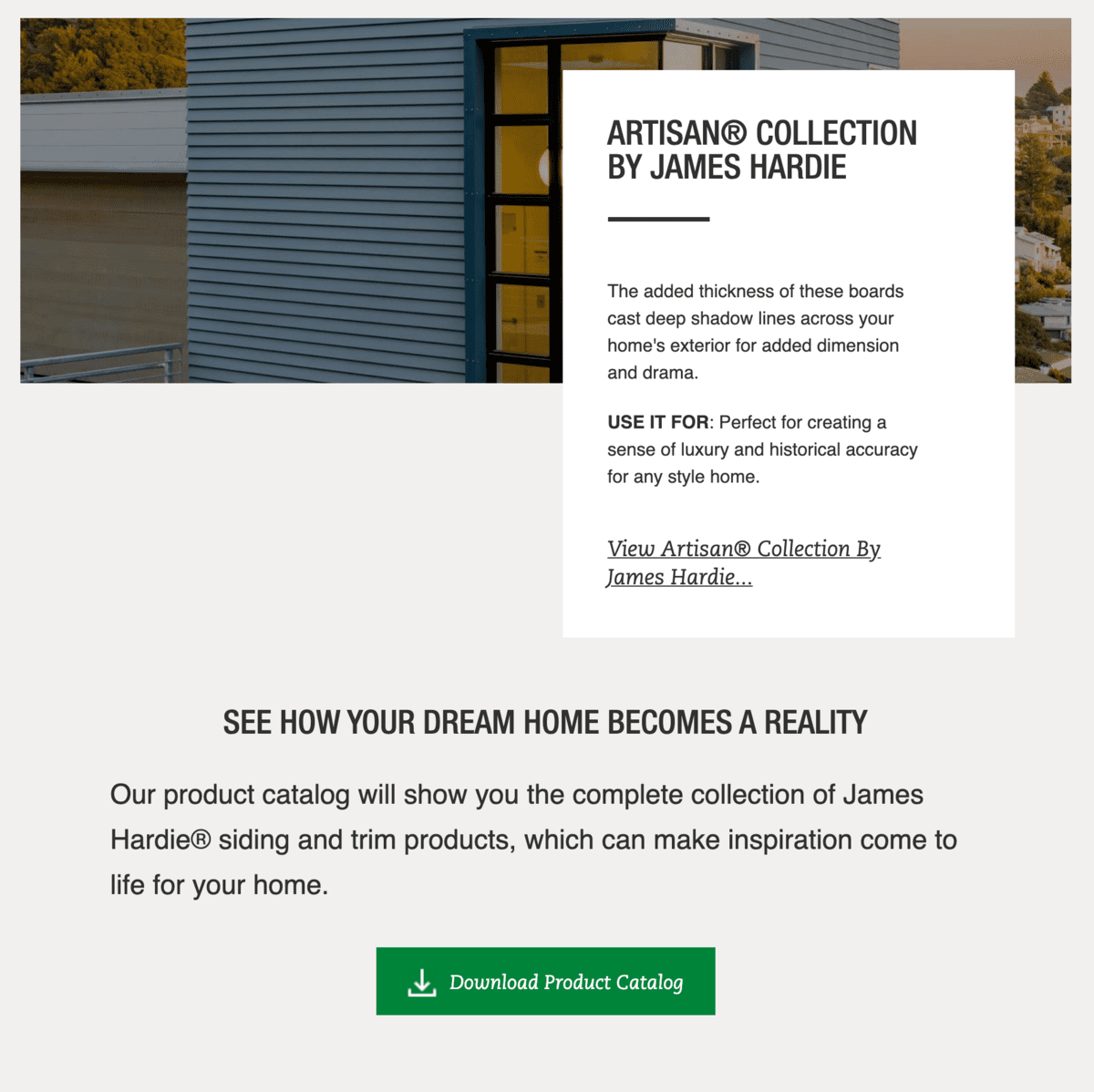
James Hardie's website does a great job of being end-user centric throughout each page, but very poignantly on their product listing page. Take a look at this one example:

For an architect, designer, or custom home builder who is specifying products for a luxury remodel in an historic neighborhood, James Hardie has made it a breeze for their website visitors to have the "This is EXACTLY what I've been looking for" moment. They have also made it easy to view their product offerings in a "distraction-free" way by offering Product Catalog download links in abundance throughout their website's users journey.
High Value Gated Resources
Gated resources that provide valuable information for channel partners and end customers are an important part of lead generation and the nurturing process for manufacturers that sell only through a channel and who sell directly through their website alike. When people give you their email in exchange for content that’s gated behind a form, you have a way to
- Nurture the contacts directly
- Route the contacts to your partners to nurture
- Re-engage contacts with updated content announcements and expanded functionality and features announcement.
James Hardie's website does this by calling out high value prospect and customer conversion pages in their auxiliary menu (see My Idea Center, Inspiration Guide, Request a Quote). This allows first-time site visitors to browse around first with an easy place to go back at any time submit their contact information in one of those three ways later, once they have decided the value exchange is worthwhile.
Notice also how the three options in this auxiliary menu correspond with the three main buckets of user intent on a website:
- Awareness > Inspiration Guide
- Consideration > My Idea Center
- Conversion > Request a Quote
As fellow inbound marketers, this is such a beautiful thing to see and a straightforward item to implement on most building materials websites!
Up To Date Product Specifications
There’s nothing that frustrates customers more than desiring to purchase a product, but being unsure if the product will work within the other products being specified. A construction products website that is effective at creating demand and desire for your product, but that does not have up to date and easily accessible product specs is missing out on revenue potential.
Further, when manufacturers take ownership of maintaining product specifications, there will be no miscommunications between end customers and your indirect sales partners either. Plus, contractors expect that the indirect sales rep will not to know enough about what they are talking about and they'd rather get the information directly from you.
Today’s buyers are doing most of the purchasing research online and may never interact with a direct or indirect salesperson, or if they do, they will wait until the very end of the process to connect. If you don’t have the information they need and make it easy to find, you may never get the opportunity for a sale.
Product Installation Videos and How-To Guidance
Most manufacturing companies focus solely on their products. What they should be doing is focusing on their customers. A customer-centric approach can still highlight your products but also demonstrate how your products solve customer problems.
It’s flipping the script from about-us to about-you.
You do this by providing valuable content that helps inform and educate your buyers. Product installation videos, how-to guides, self-serve resources, or knowledge centers demonstrate both your expertise and your willingness to help your distribution parters and end customers.
Can a new customer rest assured knowing you're committed to their success and vigilant about providing top notch service after the sale.
Warranty information
You’ll want to include warranty information on your website so that potential buyers know what’s included (and what’s not). This is also a great place to demonstrate your commitment to your customers and let them know you stand behind your products.
Further, when you have quality warranties, you reduce the risk to contractors and builders who are specifying your products. It's their company name on the line too, after all.
Partner & Product Locator Directory
When customers are ready to buy your products, you want them to be able to connect with your partners quickly. In the recent past, our very own Kevin Dean was on the hunt for new windows. He found the exact ones he wanted but he could not find a way to purchase them directly, nor find a distributor or dealer who carried them. In other words, Kevin had the purchase intent, but no way to hand them his money! Don't be like those guys....
Instead, house some sort of distributor, dealer, or independent agent directory on your website that facilitates lead routing manually or automatically. James Hardie does this via their Contractor Directory.
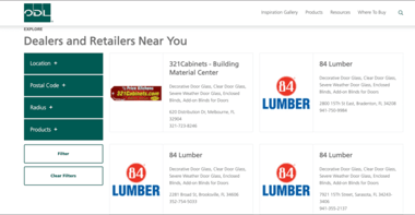
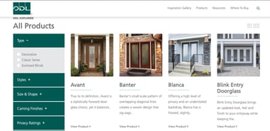
If you have a website on the HubSpot CMS, ManoByte's developers have a straightforward, easy to edit module you can install to your site. Here's the tool in action on ODL's manufacturing website, first as a dealer and retainer directory and second as a product listing directory.


We call this tool the "FindIt" App, and it allows you to create and manage any kind of directory you could possibly need as a building materials manufacturer. From product directories, to distributor and dealer directories, to qualified contractor directories, to big-box-store availability, you can customize it to your needs and keep from losing sales like in the story of Kevin's intent for window purchase.
How many of these key website components are optimal on your materials manufacturing website?
Ready to Dive In?
Work with our team of Business Process experts and watch us take manual clunky systems, tech stacks, and processes and turn them into tailored, intelligent workflows that deliver business outcomes.


