How Intelligent Web Design Strengthens Your Sales Funnel
Chelsea Carter

Think back to when your company first launched its website. It was probably a pretty big deal, right? With the flip of a switch, your business suddenly became both discoverable and accessible to a new global pool of potential customers.
But can you recall the last time your site actually acted as an attributable lead and revenue generator for your business?
In this post, we’ll cover how smart web design, reinforced by a simplified user experience, can refine your sales funnel and increase conversions for sustained profitability and maximum ROI.
Is Your Web Design Helping or Hindering Your Credibility?
When we hear "website redesign" our brains tend to default to thinking about the aesthetics or 'look and feel' of our website; but effective website design is so much more than how your site is visually portrayed.
Done correctly, website redesigns can drastically improve visitor experience through simplified navigation, personalized experiences, and decreased site load times, while simultaneously helping with search engine optimization (SEO). Together, these elements help to spur lead generation, shorten your sales cycle, and ultimately lead to increased sales and ROI.
Though looks aren't everything, appearance certainly lends its own significance to an optimized website.
We often hear the importance of first impressions in human interactions, and it's not much different for your business. For many visitors, your website may very well likely be their introduction - or very first encounter they've had - with your business. Here's why this first impression is so critical: studies have shown that the user forms their opinion of your company in less than 50 milliseconds (that's about 0.05 seconds) of being on your website.
By the same token, it's essential that your site conveys instantaneous credibility, with one user survey ranking credibility at an importance of 4 out of 5. This is particularly true for eCommerce sites, since the proliferation of data leaks and hacks mean that users are much more wary of giving away their credit card information to just anyone online.
When done correctly, a professional website design will tremendously improve your company's credibility. Strategic and smart web design will also increase the likelihood that visitors will feel like they're in good hands, and help them to feel comfortable enough to trust and buy from your website.
Easier Navigation = Easier Sales
Usability is arguably the most important feature when it comes to designing a website for sales enablement. In fact, one HubSpot survey showed 76% of respondents ranking "ease of use" as the most important characteristic a site could have.
Proper design strategy enables you to show users exactly what you want them to do; leading them through your marketing funnel without the need to ever pick up a phone.
This ease of navigation is often achieved through simplification. Because your website is a reflection of your company, it can be tempting to put as much information as possible on your homepage. But the fact of the matter is that your homepage isn't going to make you any sales.
Instead, you should encourage users to click through to landing pages where you can turn those users into leads or better yet, right to your storefront.
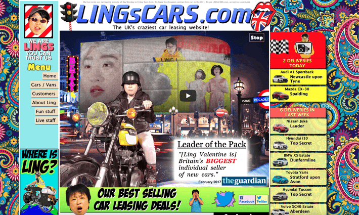
Take a look here, as an example:

If you can set aside the fact that LingsCars.com uses about a thousand different colors and even blinks (which you mercifully can't see in the above screenshot), can you tell what a customer is supposed to do when they land on this site? There's also so many links, fonts, and moving objects that the whole thing just comes off as overwhelming and confusing.
And although we can't deny the fact that Ling looks like a total badass on that motorcycle, does this give off the vibe of someone you want to entrust with your family's next vehicle purchase? Maybe, maybe not so much.
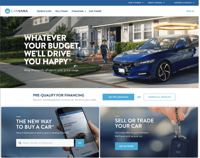
Contrast Ling's with:

At Carvana.com, you're supposed to buy, sell or trade your car. When you land on the homepage, that's exactly what you're directed to do. There's no extra copy, random, busy graphics, or unnecessary information; just simple navigation that prompts you start your vehicle search or get an offer on your existing one right away.
There are endless examples of both types of sites, but the point remains that the better you can distill your site’s navigation to the exact path you want a user to take, the more likely that user will be to follow that path and eventually become a customer.
Smart Web Design Promotes SEO
Strategic and optimized website design grants you the added bonus of not necessarily needing to increase site traffic to boost sales, because a larger percentage of your visitors will be led through your simplified sales cycle. But lucky for you, improved SEO results and an increase in site traffic is often a natural side effect of a redesign.
When your website is clear and easy to navigate, Google spiders can better understand your site, too. Further, a redesign that includes mobile optimization (another absolute must) will automatically improve your mobile search rankings.
The higher your rankings, the better your traffic, the faster those sales numbers will climb.
Nice to Meet You, MQL
Your website is a key investment in your business. Think of how many of your future customers will see your website before they know anything else about your company -- (here's a clue, it's a lot). So how else can you stand out to users from that very first interaction, while also determining the likelihood of them actually converting from website visitor to customer?
Your website should be able to guide a new visitor down a path that is tailored to their needs, which means giving them content that they want in a way that makes sense.
Implementing a strategy that crafts personalized user experiences will enable you to collect valuable user data and help you better qualify that user (who may otherwise have remained a stranger) into a qualified marketing lead.
How You're Giving Away Leads
As a B2B company focused on helping and delighting your customers, you have a lot of valuable information to share with users. From pricing data to compatibility information and product or service comparisons, you're a veritable fountain of knowledge! And that's why interested people will gravitate to your website. The question is - what will they do once they get there?
If your site is anything like most mid-market business sites, the answer is pretty simple. Visitors will come to your website, download your eBooks, spec sheets or other offers and scurry off into the night.
Will they come back? Maybe. Will you be able to contact them, answer their questions, and send them highly targeted marketing emails encouraging them to come back? No.
These mysterious visitors could be leads if you play your cards right. But right now you're letting them get away.
What to Do Instead
The good news is that there's a better way to collect data on your website visitors that plucks them from out of the "stranger" pool and puts them squarely into your "leads" pool. This is where landing pages come in.
Landing pages are pages of your site that include forms and descriptive information about your downloadable content or other engagement opportunities. When someone visits one of your landing pages, that means they're already interested in what you have to offer. So interested, in fact, that most of them will fill out a form that includes their contact information in order to access your offer.
With landing page forms, you can (and should) also ask for more than a name and email address. Take this as an opportunity to ask one or two simple questions that will tell you if the visitor is actually a qualified lead for your sales team. This will often entail a question about their company or their job including yearly revenue, their decision-making power, or their title.
When you collect this kind of information, you can easily categorize new leads and send them to your sales team in a way that makes it much easier to follow up relevantly, personably and effectively.
In Conclusion...
Your website has so much potential! If you've contemplated a website redesign or are looking to build a site from the ground up, consider working with someone who displays a proven track record of successfully helping businesses optimize websites for lead generation, conversions and revenue generation.
Ready to Dive In?
Work with our team of Business Process experts and watch us take manual clunky systems, tech stacks, and processes and turn them into tailored, intelligent workflows that deliver business outcomes.


